

The Beginning of Holmes National Park
The brand for Holmes National Park started with a logo, colors, and typography. Inspired by the styles of Works Progress Administration designs for national park posters, the warm, natural color palette paired with bold, adventurous serif typefaces visually communicate feelings of familiarity and comfort.
Logo Sketches
Logo
The logo that I decided on is indicative of the shield shape used for the logo for the National Park Service. The colors used in the landscape are warm and give the brand a welcoming and comforting feel. This logo has detail and balance in the landscape that is not present in the other logo drafts. It is used on all of the materials printed for the national park including posters, brochures, and advertisements.
Typography
Color Palette
Infographics
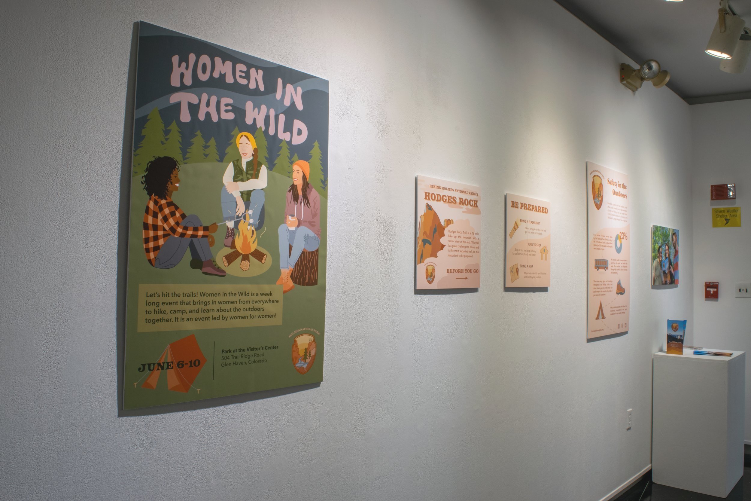
Using research on how unsafe women and people of color can feel in national parks and outdoor spaces, this infographic shows the measures that Holmes National Park is taking to ensure that all people feel safe. It informs on the measures that Holmes National Park is taking to create a safe environment for all communities. The warm, natural color palette with san serif typography emphasizes feelings of safety, comfort, and dependability. The visually interesting icons convey the information in a simple way, and lead the eye through the infographic.
Brochure
The brochure for Holmes National Park needed to be welcoming and make people feel as though they would be included and want to visit the park. The natural, warm color palette emphasizes the welcoming and soothing feel of the park. The icons and simple illustrations draw the viewer’s eye to the important information and lead them through the brochure.
Event Posters
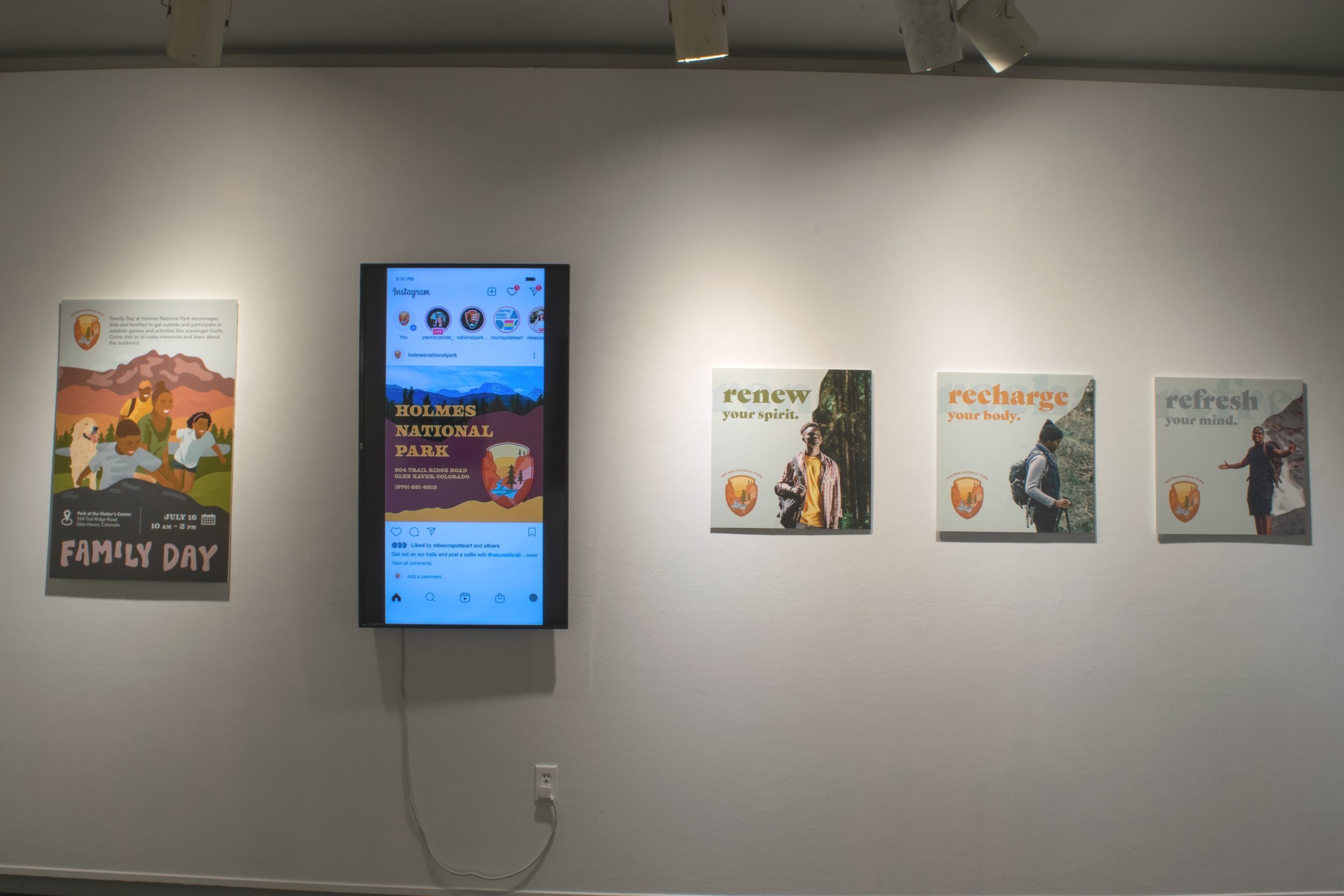
These posters for events in Holmes National Park highlight events that encourage women and families to visit the park and feel safe while doing so. The free and loose hand lettered typography paired with illustrations of women and families coming together gives the posters feelings of familiarity and comfort. The warmth and comfort conveyed in these posters will encourage women and families to visit Holmes National Park.
Advertisements
These advertisements for Holmes National Park have diversity and representation in order to ensure that people of color feel welcomed and included in outdoor spaces. The use of photography paired with organic forms and adventurous typography give the advertisements an exciting energy that reflect adventure and encourage people to visit the park.
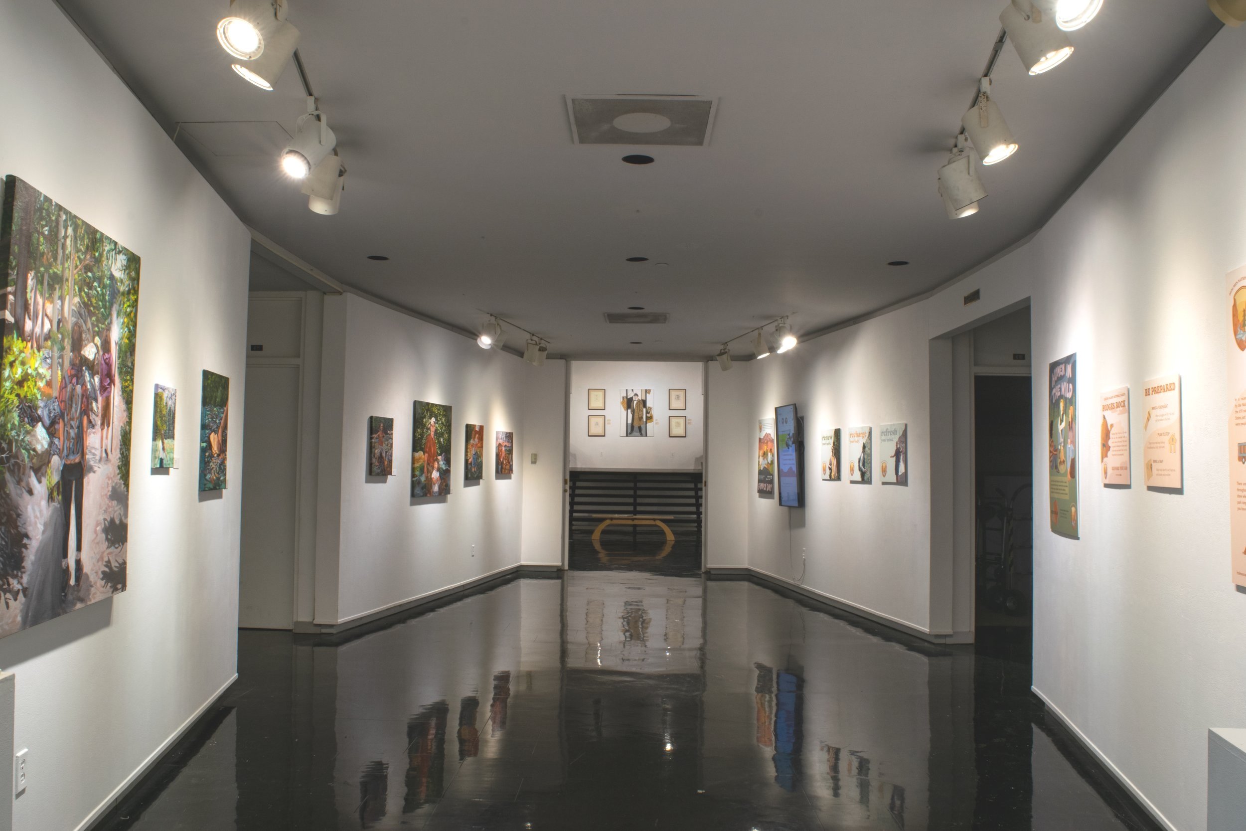
This exhibition was on view in the Clara M. Eagle gallery. This body of work included posters mounted onto foam core, social media advertisements presented on a mounted television screen, brochures and postcards on a pedestal, and a series of paintings. The decisions about installation involved arranging pieces in different ways to see how they would work together, and grouping work that is similar in style.


